


I'm pretty sure that the last time we went through this, I decided, somewhere between choosing the kitchen benchtop and choosing the laundry wall colour, that we were never doing this again. Ever. And yet, here we are, not 12 months later, doing it all again.
This is our third house together and, somehow, the most difficult. The Old Girl is just so terribly old. She's sorted. She knows her style. She's restored to her former glory and it's pretty glorious in a simple, old-school kind of way. There's only one room that needs our help for now. And the pressure of getting it right is getting to me.
The Fibro needed a complete overhaul. Head to toe, top to bottom. When you're changing everything, you just get in there and go for it. It needed bringing into the 21st century and into the 21st century it came, albeit kicking and screaming.
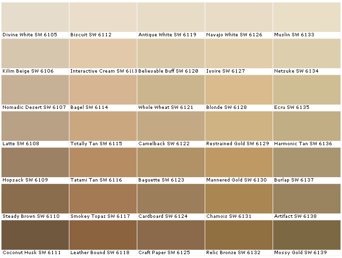
The Old Girl is more your 19th century kind of girl. Genteel. Hitting the right note between that and 'I don't want to live in a museum' is not easy. I wanted to paint the room white. But the white paint chart was more daunting than the coloured paint charts. Who knew there could be so many? And, yes, we considered Hog Bristle, like every other household in the country. But we can't go there. The Fibro was Hog Bristle (half) on the walls and Hog Bristle (quarter) on the timberwork. We can't press repeat.
We'll get there. Of that I have no doubt. In the meantime, the man at the paint shop and I are becoming very friendly. "Are you sick of the sight of me yet?" I asked the other day, popping in for our 11th sample pot.
"Oh, you're not my best customer yet," he said, popping a splodge of yellow into the Haynes Beige (half) he was mixing up for me.
"I'm not?" I said, somewhat put out by this. I thought we had something special.
"Nope," he said, dolloping in some black. "That spot is reserved for the lady who took 25 sample pots to decide on a colour."
We were both silent a moment, me contemplating the horror, him no doubt dreaming of another customer who'd spend over $100 in sample colours (at least I'm only halfway there...).
"What colour did she end up choosing?" I asked.
He laughed. "The second one she took home."
Tonight I sit here and contemplate my patchwork walls as I write this.
We're pretty sure we've chosen a colour.
The first one we considered, only knocked back to half strength.
There's a lesson in here somewhere.
What colour are your living room walls?
[image: from here]


A horrendous pale pink (called Caress) that my Mum chose in 1990. With pale grey trim (called Shady Lady). Is it telling that I can remember the names of the paint even though I was 16 at the time and it is now 23 years later???
ReplyDeleteWe so need to repaint (esp the living room) so I am following your journey intently!
Love it! The names are often so much more inviting than the actual colours... Shady Lady sounds fab.
DeleteHoney cream which is the most conservative and easiest colour chice I've ever made, I didn't even buy a test pot AND I like it, amazing no?
ReplyDeleteMy kitchen is a patchwork of different colour samples and has been for nearly 2 years, I just add to it every few weeks while I try to decide (I've stopped counting the cost!) and now Im wondering if I might paint the units a diffent colour while Im at it.
I horrified myself by painting my teenage daughers bedroom grey, it looked like a battleship, nothing like the picture in my head! But, since adding lots of silver, turquoise, glitter and mirrors it looks fantastic.
We have a lovely grey as part of our patchwork. Won't work in the living room but I have earmarked it for the boys rooms.
DeleteClotted Cream (half strength) with white trims. Very cheery and warm, yet classic. I have painted three houses and this has been my favourite shade by a long shot.
ReplyDeleteI was eyeing off clotted cream. Along with half a dozen other shades... Sigh.
DeleteSomething off white at quarter strength. When in doubt, go quarter strength!!
ReplyDeleteLOL. Fade to pale.
DeleteWould you believe our walls are Hogs Bristle half strength lol. Some rooms are Vivid White and the Lounge and a feature wall in the Master Bedroom is a version of Warm Neutral that I altered.
ReplyDeleteSoooo... what colour did you choose?
If you get stuck on paint colours again let me know - I know a group of people online who would be happy to help you with the decision #wink
I'll definitely call!
DeleteSago- love it!
ReplyDeleteHmmm. Haven't seen that one. *runs to paint chart*
DeleteAl, when we livied in our old fibro we had brillian white walls. No tint allowed. And a feature wall in every.single.room. Some were even suede effects. (It was the era of the lifestyle channel...)
ReplyDeleteAnd the '70's monstrosity we live in now? Mostly the same - antique white. Apart from our room - Hogs Bristle FULL strength. Shit, we know how to live.
xx
Suede effect? Baby you were living the dream!
DeleteHousing commission cream with white trim.
ReplyDeleteI'd probably be allowed to paint if I filled out the correct application form, but that would mean moving several pieces of too large furniture as well as going through the headache of choosing colours.
Sometimes it's better not to have a choice River - I agree!
DeleteOur house is 1930s, so I know where you're coming from. Ours is magnolia, which should tell you when we last had it painted. ;)
ReplyDeleteMagnolia makes me laugh!
DeleteGood luck with the choosing, Al. It can be a bugger deciding. My new house is very white - Whisper White {dulux} everywhere except Lewi's room which has 2 walls of Klavier which is black! This colour palette is very subdued for me. My last house had over 10 colours. Going from a rainbow to a psych ward;) x
ReplyDeleteWhisper White was down for the trim, then it went to Fair Bianca Half, and now I think we're at antique white. Who knows anymore?
DeleteOur walls are a horrible pale yellow colour with blue/grey carpet. Would LOVE to change them, actually would love to change the whole house but we are renting. Arrrhhhh Guess I am stuck with it! Good luck with the final colour.
ReplyDeleteAt least you have an excuse for the terrible colours. What if you actually chose those and then everyone said 'ugh'? I think this is one reason everyone goes for Hog Bristle...
DeleteI'm pretty sure ours are peach! Or apricot. Worst bit is they painted the ceilings the same colour! I'm planning on painting our bedroom dove grey with white trim. And the ceiling will be white too, as it should be!
ReplyDeleteOh yes - always white on the ceilings. Always!
DeleteI call mine 80s apricot. My decision was easy as a friend came around one day and did a colour chart thingy for me for all the rooms in my house. This colour is in the hallway and kitchen as well. See for yourself http://www.flickr.com/photos/jaycee/242727052/
ReplyDeleteWow - that works really well. Surprisingly well. *goes away to rethink*
DeleteI live with my parents. Their lounge/dining/kitchen is Sunburnt Orange.
ReplyDeleteThe entryway is a light cream, and Mum had this brilliant idea to just paint the trim Sunburnt Orange, and then put some orange flower decals on there. A friend came over and, upon sighting the decorated entryway, sympathised with Mum for being in the middle of decorating. 'Don't worry, it'll look much better once you've finished, and you're halfway there!'
Oh my. The bold choice can be too much for some, right?
DeleteI'm embarrassed to say this! Hog Bristle. Quarter strength. Hubby could get it for free through work so we didn't have the millions of sample pots and colour charts beforehand, though. Good luck!
ReplyDeleteThanks Emily. Don't be embarrassed - it's a popular choice for a reason. It's a great colour!
DeleteOur current house we have a white shade called portico, it is bright and lively, we also have a mocha feature wall. In our new house we are just having portico again with a feature fire place but not sure on colour yet. I love white walls as they come alive when you add splashings of colour with furnishings and photo's.
ReplyDeleteWe have an old beach fibro/shack. The lounge room is painted beige. Well Dulux Fiji Sands. Thinking about repainting with a lighter colour (of beige).
ReplyDeleteWHITE.
ReplyDeleteEverything here is WHITE.
WHITE WHITE WHITE WHITE
*sighs*
I had white trim on some walls and a couple of cupboards a long time ago, it was called pearly gates, by wattyl. It was very nice.
ReplyDeleteHave you thought of doing a feature wall to add interest? Use the same colour, but paint it over an embossed wallpaper. My grand daughter has this in her room, where she wanted black paint. A compromise was reached where just one wall was painted black over an embossed paper.
Nearly all our house is painted 'russian white', which is a british paints colour from years ago - it's a fantastic light beigy-cream, goes really well with blue upholstery & brown upholstery, and that weird chair which is both blue and brown. We do have a purple feature wall (well, it's actually called 'lavender lake' & it's the same colour as our kitchen cupboards. It's a bugger, isn't it? I think that woman with the 25 sample pots might have been my sister-in-law, she's got patches all over the house...
ReplyDelete